-
Richard Quinn
Editor emeritus: Antique Studebaker Review -
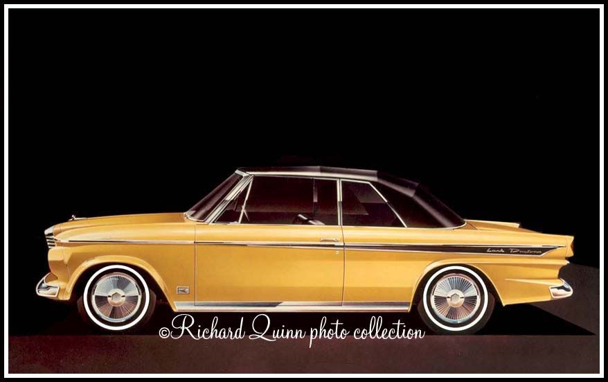
Interesting! Thanks Ricard. Whenever I look at these penned proposals, I'm struck by the details that DIDN'T make it to the production line. In this case, the aft side moulding - what we have come to call a "butterknife" - looks more like a fountain pen in this drawing. What I wonder is WHO deemed that the "pen" wasn't THE desired look. Was it Stevens, whoever signed off on his work, or someone who decided tooling for the butterknife look was less expensive than the pen look?
As well, what we got in the end was a recolor of the wheelcover that had been in use since '59. Certainly THAT was a matter of costs. In any of these stylings/facelifts - SOMEONE has to say: OK - that's what we're going with.No deceptive flags to prove I'm patriotic - no biblical BS to impress - just ME and Studebakers - as it should be. -
I like the lower moulding treatment myself. Makes the car look lower & adds class. I dont care for the front end panel but from this angle the tail lamp housings look very much like what was adapted for 64.59 Lark wagon, now V-8, H.D. auto!
60 Lark convertible V-8 auto
61 Champ 1/2 ton 4 speed
62 Champ 3/4 ton 5 speed o/drive
62 Champ 3/4 ton auto
62 Daytona convertible V-8 4 speed & 62 Cruiser, auto.
63 G.T. Hawk R-2,4 speed
63 Avanti (2) R-1 auto
64 Zip Van
66 Daytona Sport Sedan(327)V-8 4 speed
66 Cruiser V-8 autoComment
-
Thank you mr Quinn for posting the picture ray wiserawiseComment
-
I think the hubcaps look like an old TV test pattern HTIH (Hope The Info Helps)
Jeff
Get your facts first, and then you can distort them as much as you please. Mark Twain


Note: SDC# 070190 (and earlier...)Comment
Thank you for visiting the SDC Forum, a service of the Studebaker Drivers Club, Inc., an International non-profit organization dedicated to the promotion and preservation of Studebaker automobiles.
Our Forum is free to use, but in order to join the discussion boards you will first need to register.
Read our Policies and Terms Of Service here.
Comment